Test page: Gallery options
options
test page demonstrating some popular gallery styles
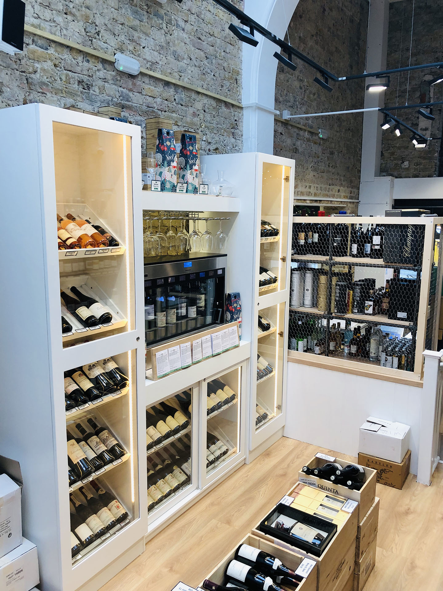
masonery gallery
reformats the images to fit into a ‘masonary’ style grid depending on orientation of the images, in user-defined order they are inserted. Different image order will generate a different layout grid depending on both image orientation and screen size. You see the whole of each image. Images are clickable and will display a title and description on hover (if one is entered, obviously)
grid gallery
Similar in features to the ‘masonery’ grid above but in this version the initial images are all cropped to fit a fixed layout height. Full image is available in a popup on click samer as the masonary grid.
carousel gallery - a
Best used at a fixed width because otherwise the main image will be either really big or really stretched on wider screens. Popup displays full screen on click. This version is full width to demonstrate the problem with cropping the main image on large screens. Height is fixed but can be set at anything – these examples are all set at 600px tall.